

Minimalist Geometric Monogram
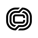

Minimalist Geometric Monogram based on a stylized letter 'S'.
I was asked to describe this logo mark in a technical sense, so using a bit of artificial intelligence here and there I came up with something like this:
It utilizes a parallelogram-based grid and intentional negative space to create a sense of motion and precision.
Geometric Construction
Parallelogram Foundation: The logo is built using two primary, overlapping parallelograms mirrored and offset from one another.
Shear/Slant: The heavy rightward lean (italics) creates a strong visual oblique, which is a standard design shorthand for speed, progress, and forward momentum.
Symmetry: The mark features 180-degree rotational symmetry. If you flip it upside down, the shape remains identical.
Form and Space
Negative Space 'S': The central letter 'S' is not drawn with a stroke; instead, it is defined by the counter-space created between the two solid black blocks.
Gestalt Continuity: The viewer's eye automatically closes the gaps between the upper and lower segments to perceive a singular, fluid character.
Terminals: The ends of the shapes use parallel horizontal shears, giving the logo a sharp, aerodynamic appearance often associated with tech, automotive, or high-performance brands.
Visual Weight and Style
Monochromatic: The design relies entirely on high-contrast solid fills, making it highly scalable and versatile for different mediums (embossing, small-scale icons, etc.).
Blocky Silhouette: The thick, chunky proportions give it a 'heavy' visual weight, suggesting stability and industrial strength despite the "fast" slant.
A rotational symmetric monogram utilizing negative space and geometric shearing to form a stylized 'S' through two interlocking, offset parallelograms.