uiuxpo.io Full Branding - Case Study


Description
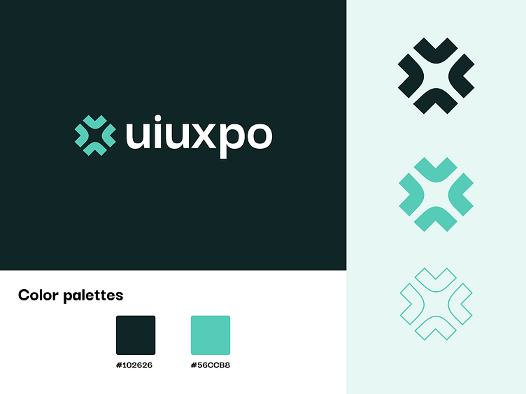
We are presenting our brand design, our focus is to keep things as simple as we can but still playful identity. We adapted the colour palette to a green tone. The shape we have used to create an X which is representing the multiple services and growth of the businesses with which we collaborate. We make sure to design not only fancy things but also provide solutions to their real problems.
-----
About us
→Follow us on: